Which graphic do you like best as a blog skin? I have a bunch of ideas because it’s been several years that I have been working on a new blog skin. I thought I had made up my mind several times but as my web guy has yet to take the artwork I have sent him from 2007 and changed my blog skin, I kept coming up with new ideas. I would totally fire my web guy but I just LOVE him, so I’m going to give him another chance…and probably another one after that. I am considering holding his shirt with it’s missing button hostage until I have a new blog skin though. Him threading a needle would be very similar to me trying to change this out myself. So, let me know what you think and vote for your top three favey faves. It won’t mean anything will change…unless that shirt, hostage thing works out.
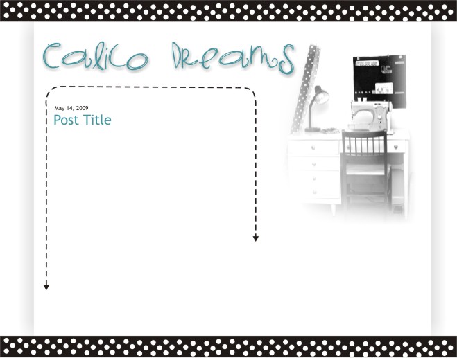
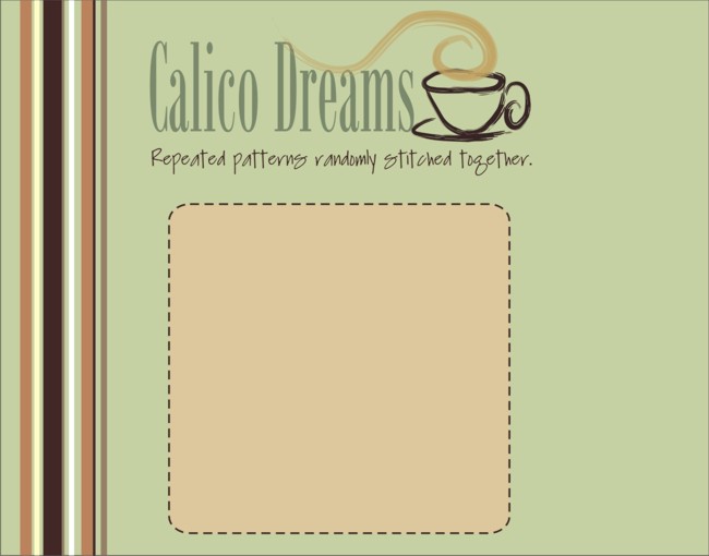
1) The Sewing Room
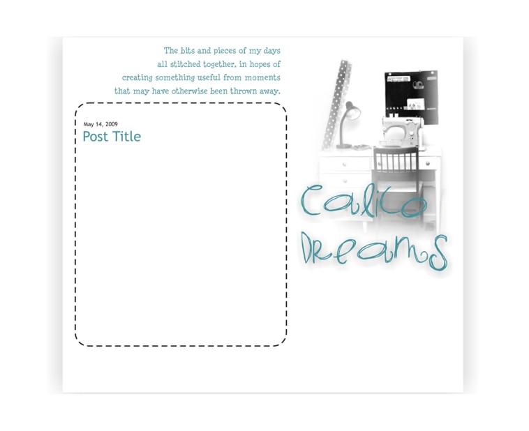
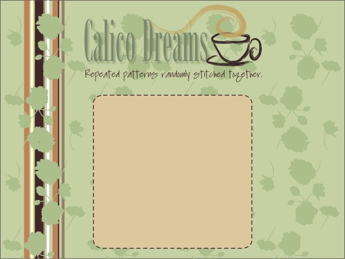
1.5) The Sewing Room Also
2) Yellow (this was the sewing room at our previous house)
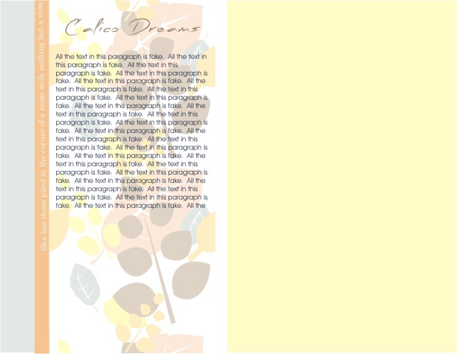
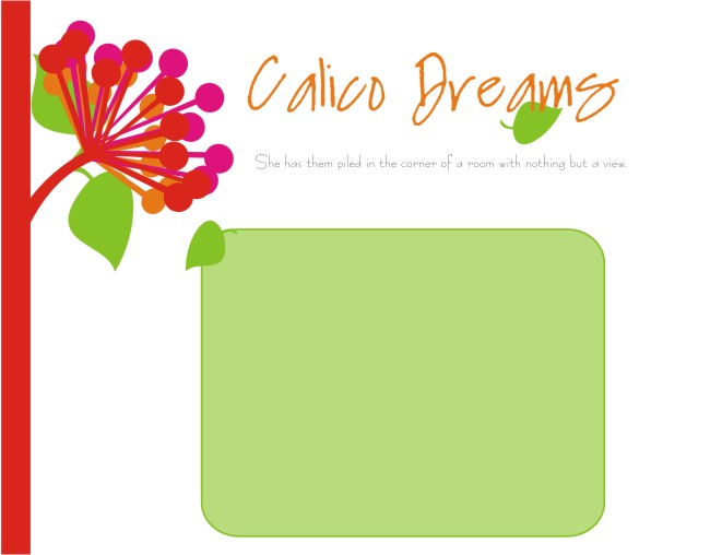
3) Peachy Leaves
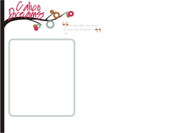
4) Funky Tree Branch
5) Sci-Fi Flower
6) Going Green
6.5) Going Green as a Conservative
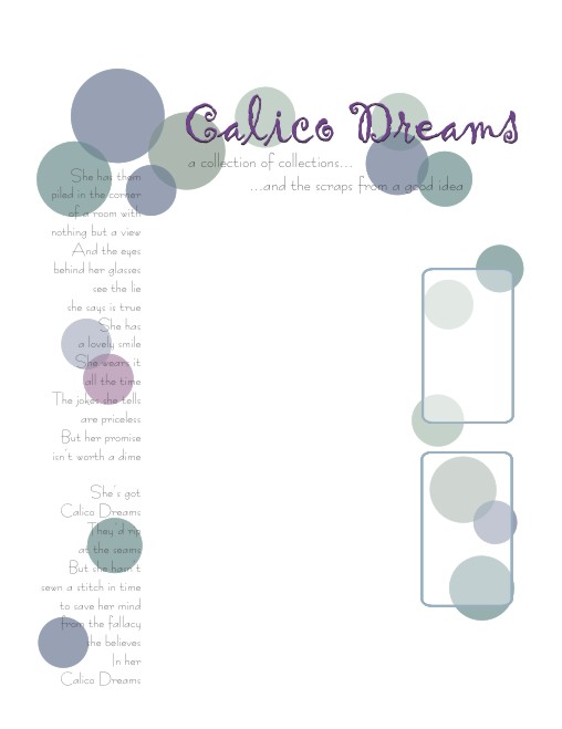
7) Bubbly
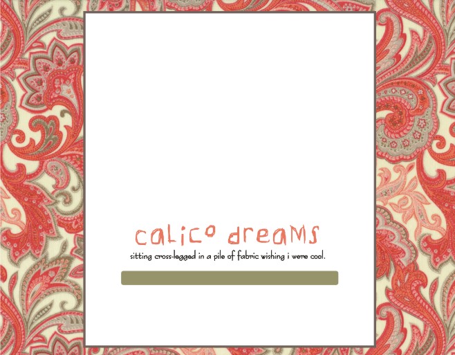
8) Faded Fabric
8.5) Not So Faded Fabric
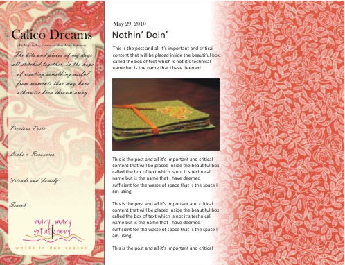
9) More Fabric Than You Can Shake a Stick At
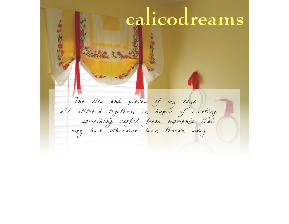
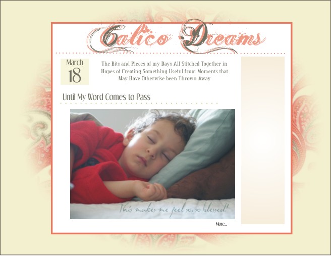
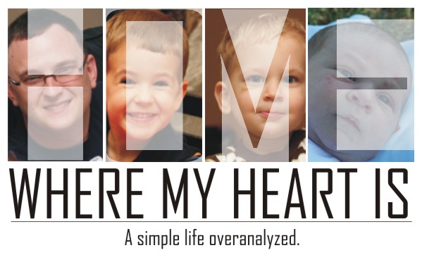
10) Home
I actually like clean and modern, more so than cute and frilly, but with a name like “Calico Dreams” and so many references to quilting and handmade cards and such, I don’t think I should go too far off the cute path. I do like cute. I actually get a little weepy in that shop in Franklin with all the shabby chic stuff. Yum, so it’s not as if I’m stretching or anything…I just get a little indecisive when I put that in front of me on the computer. Of all places, this is where I should go with clean lines right? Nah.
So lets review. Vote for the three…that’s 3…that you like most. You can include the current blog skin if you want, but I’ll toss out the rest of your votes because you obviously have very bad taste. You can vote on tag-lines too, but I probably won’t change it. My favorite is 8.5 but I wouldn’t ever use it. It just makes me laugh.
I’m going to break your rules and vote for 1, 1 I tell you!
I vote #9.
Ok, so I’ll go a little further… I kinda like #10 too, very simple and modern but only really covers part of what you talk about here (ok, it’s a big part, but still).
And you really have to switch to the tag line in 8.5, I’ll be very disappointed in you if you don’t 🙂
I like 4 & 5 and you can pick my third for me 🙂 Although those two might be much more “Amy” than “Mary”. I think I’m trying to make you stray from blue a little bit…or I’m just tired of looking at blue at my house. I’ll let you psychoanalyze it for a bit 🙂
I like several of those tag lines.
2,4,10 i see we are all on different wave lengths! I’m trying to get back into blogging. I miss my blogging friends!
remaining completely anonymous (what using only my first name and all), I would like to cast my vote for my two favorites: First – #8.5 “Not So Faded Fabric” Second – #4 “Funky Tree Branch”
(8.5)I’ve always digged (or is it dug) the paisley side-of-things and those colors are groovy. Having only one pattern pleases me, esthetically. Believe it or not, I consider this layout clean and simple
(4) and while I’m referencing disco-like adverbs; I lean toward any descriptions containing the word “Funky.” But, it passes my clean/simple looking layout, requirement just fine!
the fonts on all the layouts are great choices. Happy Blogging!
I like 1, 4 & 6.5
2, 9, 10… I like your saying on 8.5 makes me giggle 🙂
I like number 1 and number 8. I’m not sure of a third one, but I think 6.5 is nice, too.
I like 1, 5, and 9 but it was hard to choose. Love your slogans, I laughed too! Pick one you won’t get sick of and give us a lighter background so i don’t have trouble reading the print.
I like 1.5, 4, and 8. I did like the titles that went along w/ each option.
ok, wow. i like a lot of them…so here goes.
i vote for
4 and 5, but i also like 1…but i like the color in the others.
i like the font in 8.5.
I feel like my lack of reading blogs and, even worse, absence in writing almost disqualifies my privilege of voting, but here goes anyway. 2, 8.5, 9. The colors are what does it for me. The yellow is so peaceful and simple. Makes me want to sit down with a cup of coffee and hear all about your day, exciting or just another day.
I have a humble suggestion if you use the sewing room desk photo….add a cup of coffee, your Bible, maybe a toy. The sewing is definitely a big part of what you do, but the additions might make it more complete. On the other hand, it might look like chaos and maybe I should just hush my mouth.
I do LOVE the tagline in 8.5!
1.5, 8, 9… I think those all are most “Mary”- though they’re all good… and I think I might chose others as favorites if it were for my own page. They run a wide range.
So… which one are you going with?????